
Moolah is an all-in-one payments and money management app for kids and teens. We created this app concept as an entry to the Rapyd Formula 0001 Hackathon. It encourages good financial habits by having the user track their spending and learn about different skills like budgeting and goal-setting through gamified lessons. Of the 76 submissions from across the world, we were one of 12 finalists and won a Judge's Choice Award for our design and implementation.
Rapyd creates APIs for payments, payout, and fintech. They hosted 1.5-month-long global hackathon that asked for projects relating to 3 prompts. My partner and I picked the first prompt: create a financial technology app while integrating two or more Rapyd platforms (Collect, Disburse, Wallet, Issuing).

My teammate and I faced a major problem going into this project: we didn't know anything about financial technology. What we did know was that we both wanted a project that was interesting to us and impactful for the target audience we pick. To develop such an idea, we started reading, researching, and interviewing people in the industry to figure out current trends and gaps in the fintech app market.
We interviewed three people with expertise in mobile payments and points of sale. They pointed out upcoming trends in fintech and payments and gave us general advice on participating in hackathons. Throughout the project, we were able to return to them and ask for advice and guidance on our idea.
One quote from our interviews was: "a lot of innovation comes from either addressing a problem in a different way or applying a solution to a different market." This idea really stuck out to me, so we thought to ourselves, which market has been really neglected?
Children! There didn't seem to be any popular payments apps among younger children aged around 8-14 whose parents might still want to monitor their spending. We realized 4 opportunities here:
For these reasons, we decided to create an app called Moolah with three key features:

We started by first brainstorming the user flow and information architecture of the app. We made a combined flow so that we could asses the app and its functionality as a whole. This helped up work out which features to include and how they would be connected.

Referencing the user flow, I was able to determine what pages would be needed for Moolah. Then my partner and I met up to sketch out how we'd want the pages to look. After that, I did some low-fidelity wireframes to brainstorm some additional concepts for the home page. Due to time constraints, I jumped straight into high fidelity mockups after that.

Due to time constraints, I jumped straight into high fidelity mockups. For each page, I created a few different versions for us to discuss and choose from.
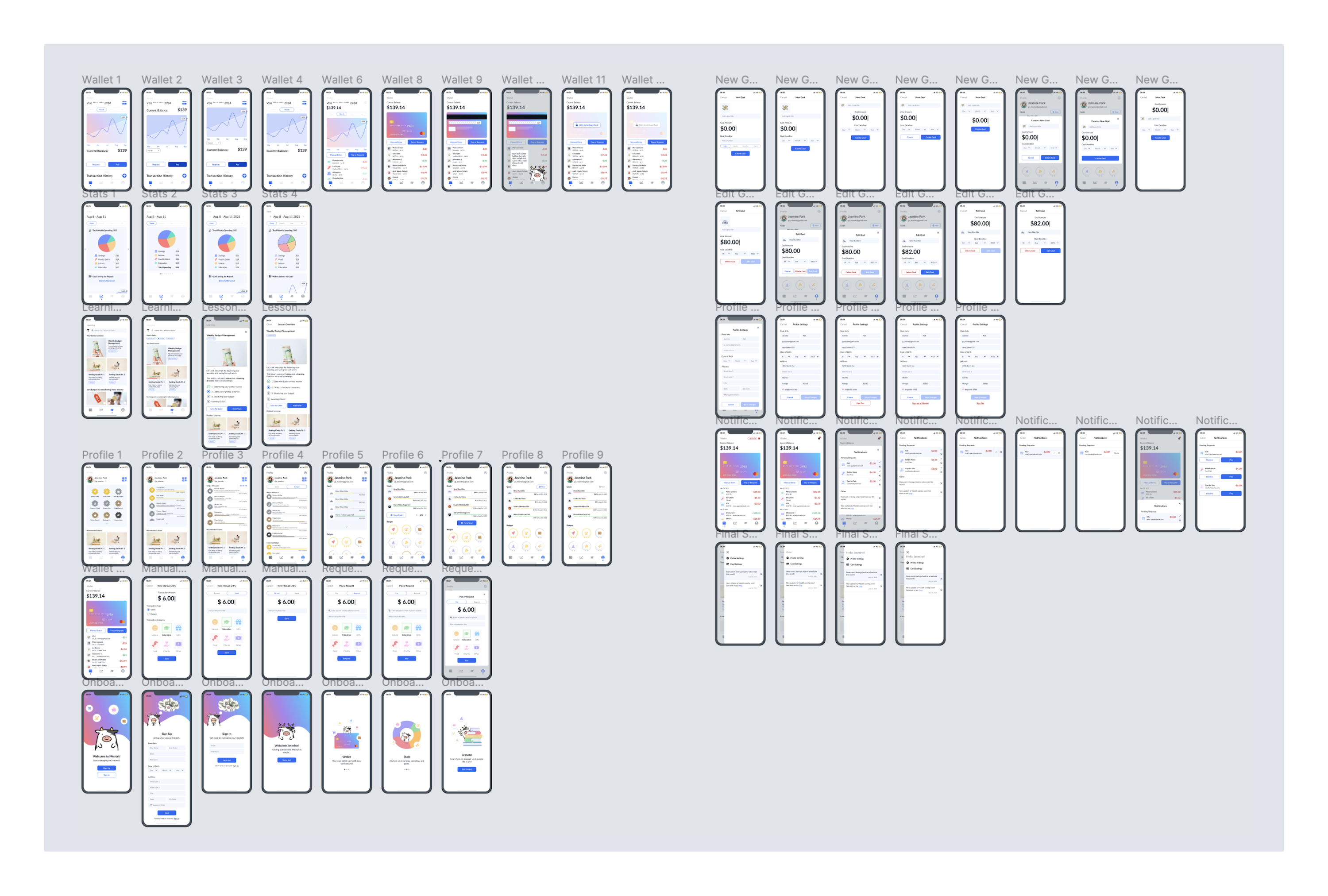
Finally the grand reveal! Designing an app to be visually exciting and intuitive for kids was super fun! The final app had a cute mascot, Moolah, who would introduce the children to the four main parts of our app: wallet, stats, lessons, and profile. Below is an app walkthrough video I made using Adobe After Effects that we used in our submission.
Below is a diagram of how we integrated Rapyd's APIs into our system design:

Here are the key screens and functions of the app in more detail:
Contains the user's digital debit card, mobile payments, and transaction history.

Summarizes spending analytics, tracks goals set by the user, and shows learning progress.

Contains all the lessons a user can watch and learn from.

Displays all the gamification badges a user can earn through Moolah

The hackathon had 991 participants from all over the world. 76 teams submitted projects and the judges awarded 12 prizes. Our project received a judge's choice award. The final design was coded by my teammate and can be see here: https://jasonpark.me/moolah/#/.

This hackathon experience taught me two main lessons:
First, brainstorming takes forever (and you need to know when to stop)! We spent the first 50% of the hackathon trying many different brainstorming strategies including timed brain dumps and keyword matching. We don't think we came up with a perfect concept to fit the prompt, but we did find one we were both personally interested in within a unique problem space. Since the deadline was very concrete, we were pushed by time constraints to limit our brainstorming time, but I have realized the importance of knowing when to stop brainstorming even with the deadline seems far off.
Second, development timelines were also important to consider and I saw how tweaks in a design can ease the job of developers. Especially since the proof of concept was most important for this project, my partner and I had to decide which features to design robustly and which ones to make simpler to get the idea across. We were also able to plan some tasks in tandem: for example, I worked on the branding and video submission while my partner coded the frontend and finished the backend.


