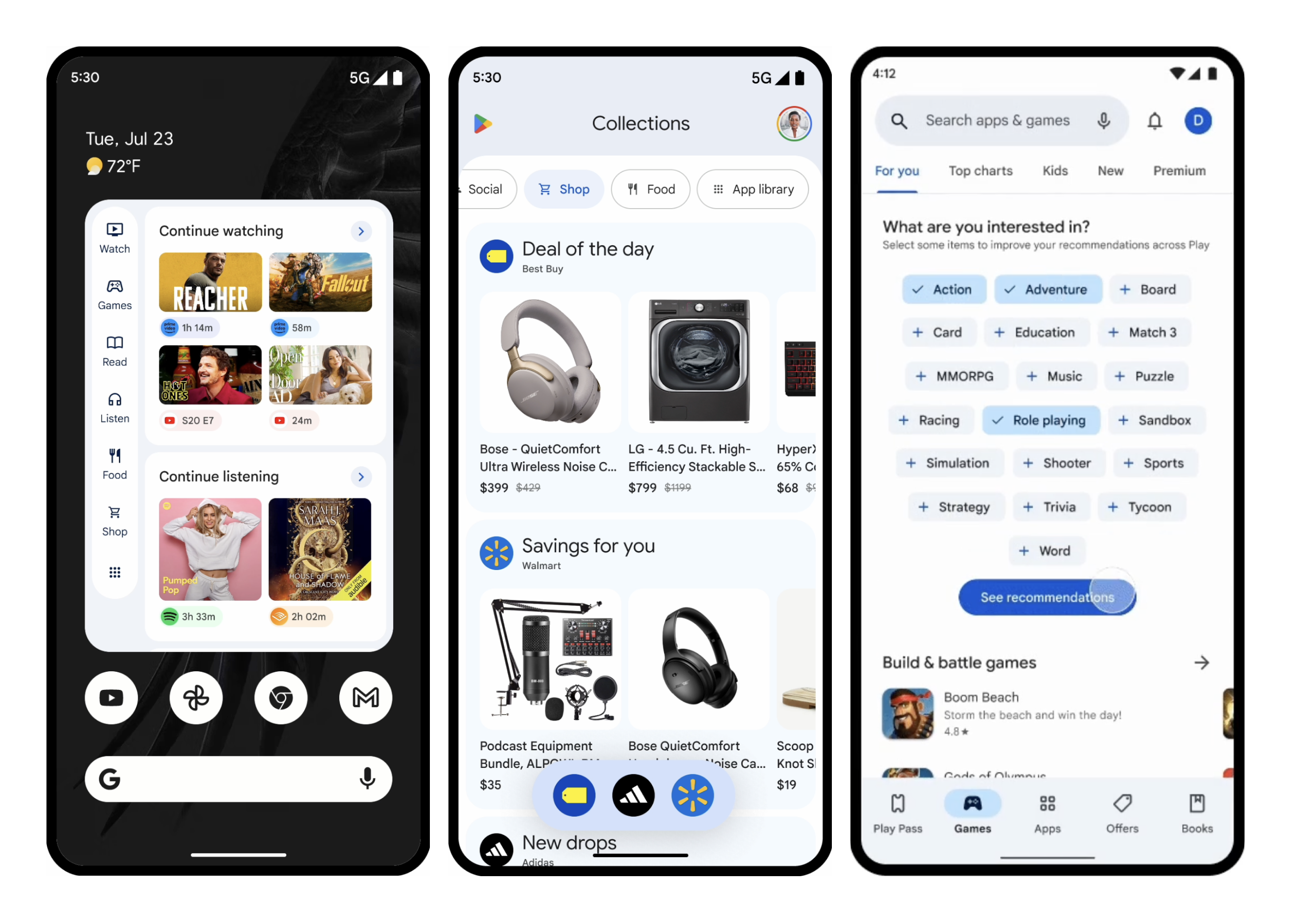
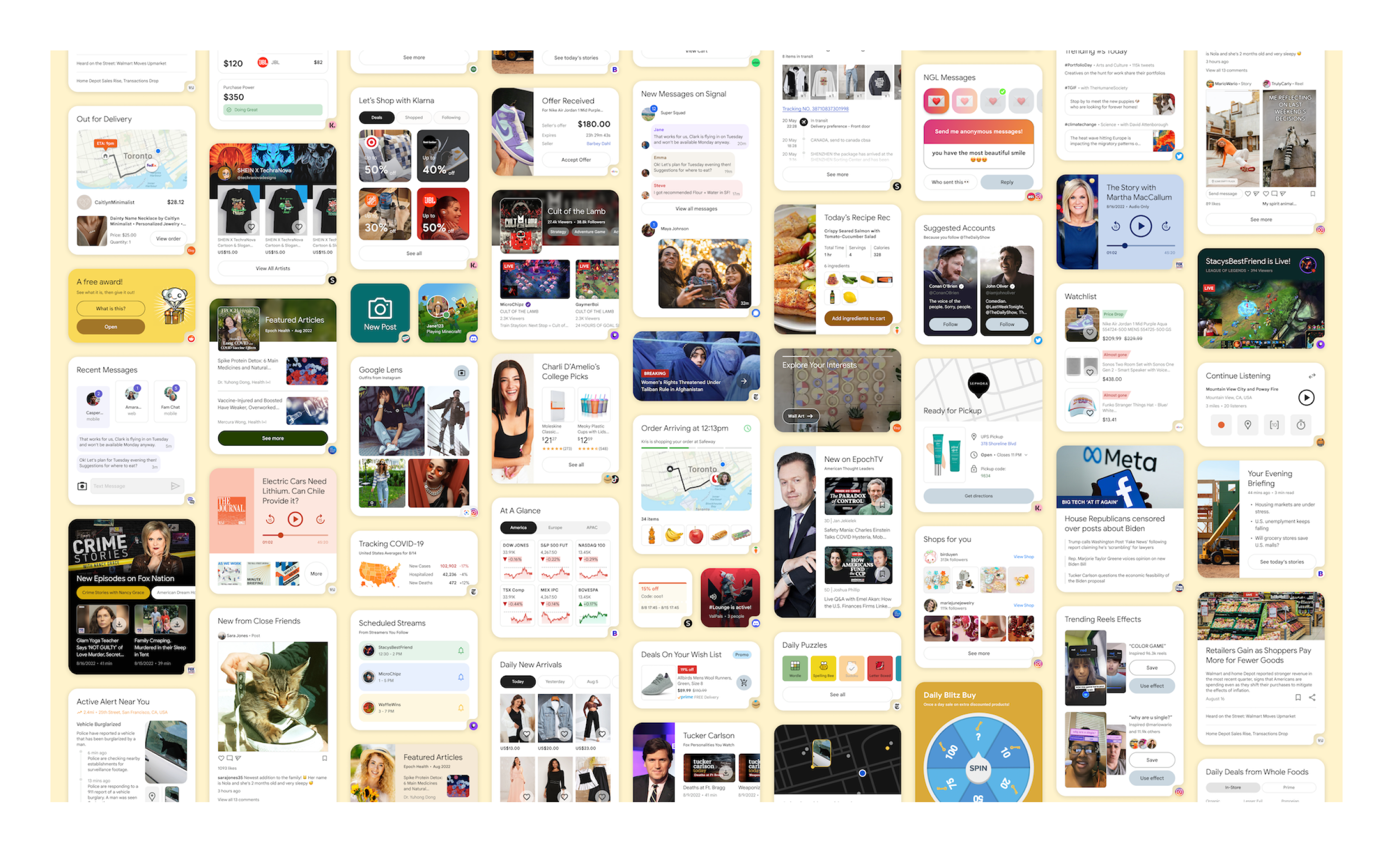
I spent the summer of 2022 interning on the Google Play UX team, where I worked on a then-internal feature called Rubik's. It launched two years later as Collections by Google Play — a home screen widget that automatically organizes content from your installed apps into categories like Shop, Watch, and Listen. When you press and hold the Play icon and add Collections to your home screen, it pulls in the show you were just watching, the products you were browsing, the article you started reading, all in one place.
Most of my time went to designing the visual surface of this feature: what the widgets would look like, how content from different apps would be presented, and how users would interact with them. Though some of these designs evolved differently for the final launch, the plethora of mocks I had created were consequential for gaining buy-in for the investment in and further development of this feature. The rest of my time went to a vision deck for the same feature and a smaller trendscraping project for a more seasoned product.
When I joined the team, the Collections feature was still being scoped. The UXR team had performed discovery research and identified that users were getting more comfortable with companies using their personal data, as long as the data clearly translated into useful, relevant content rather than spammy ads. That insight was the seed of the whole feature: what if we used valuable home screen real estate to give users content they actually wanted, sourced from apps they had already chosen to install?The challenge was twofold:
My job, broadly, was to help make that case visually and strategically tangible.
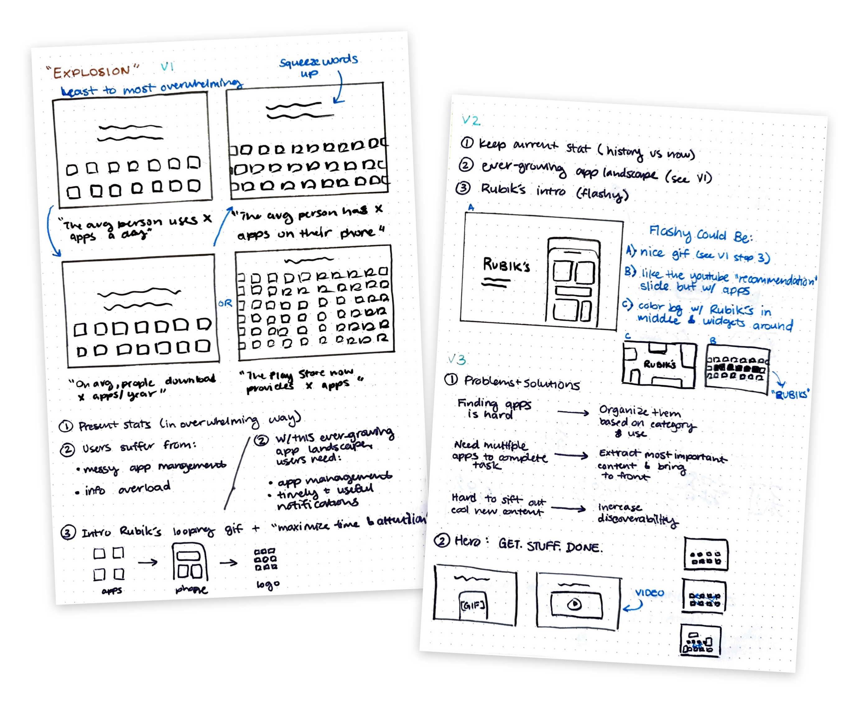
I started by helping update the team's vision deck, which was used to communicate the feature's potential to senior stakeholders. I was specifically asked to design the opening "explosion" section — the part of the deck that needed to land hard and fast, summarizing the why before the how.
I read through the existing deck versions, supporting docs, and UXR studies, and surveyed 11 internal and external decks for examples of compelling story structures. I sketched out approaches with sticky notes, brought them to my manager for feedback, then built the slides in Google Slides with custom visual assets in Figma. We went through three rounds of iteration with my manager and her manager — the team's design strategy lead — before agreeing the section was in a good place.
My manager and the strategy lead both said I brought a fresh perspective on how to communicate the story behind the feature, which felt good given how senior the audience for this deck was.
Once the vision deck was in a good place, I shifted to my main project: designing what the actual content inside the feature could look like. The team's ask was relatively open — make example widget designs for the top ~30 apps in the Play Store, drawing from the UXR team's insights about which content domains users would find most valuable.(Simple, right?)I worked through this systematically:
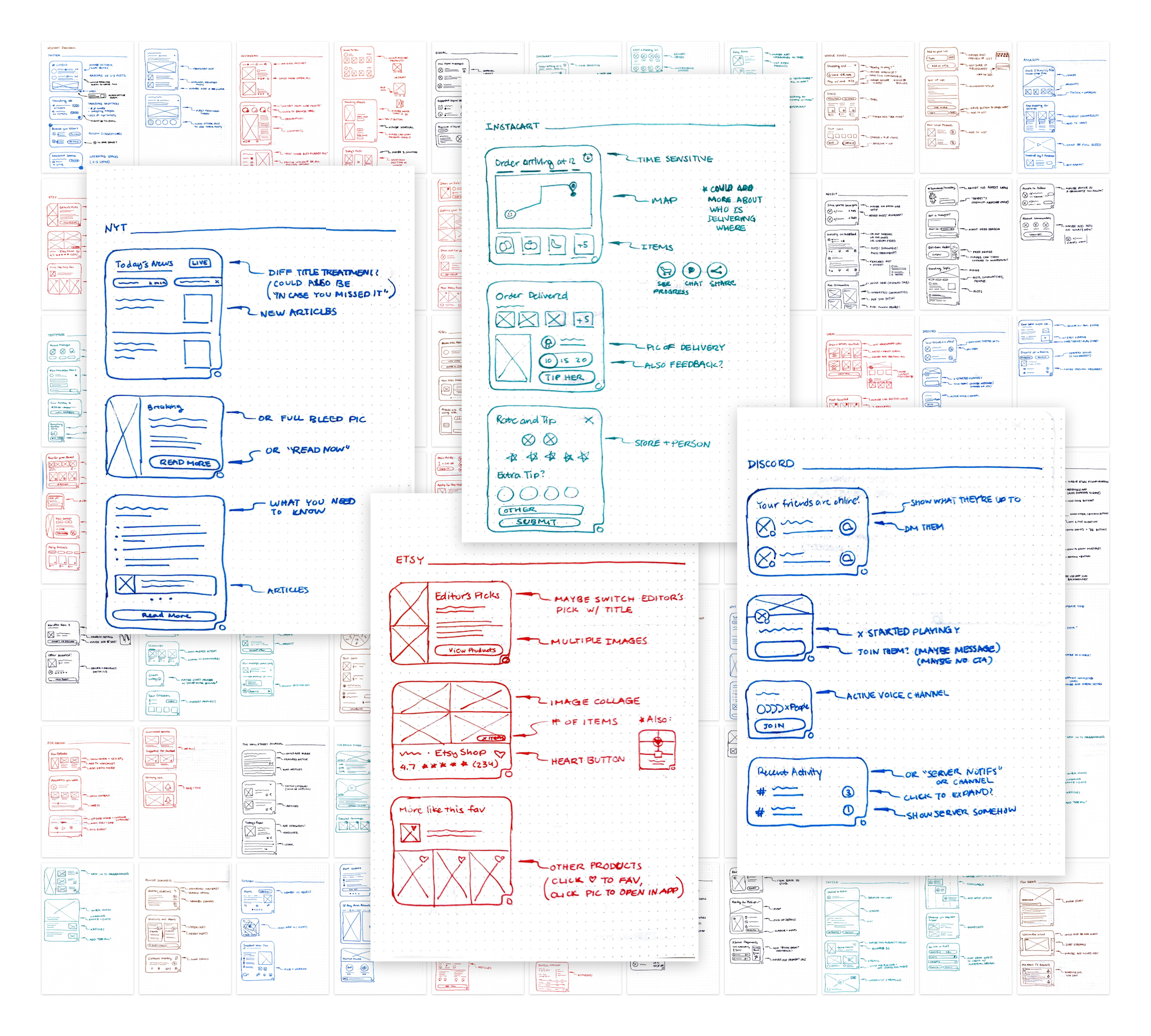
By the end of the summer, I had created 579 total design iterations, of which 93 were finalized and exported for the team to use.These mocks weren't just for show. They were used in three concrete ways:
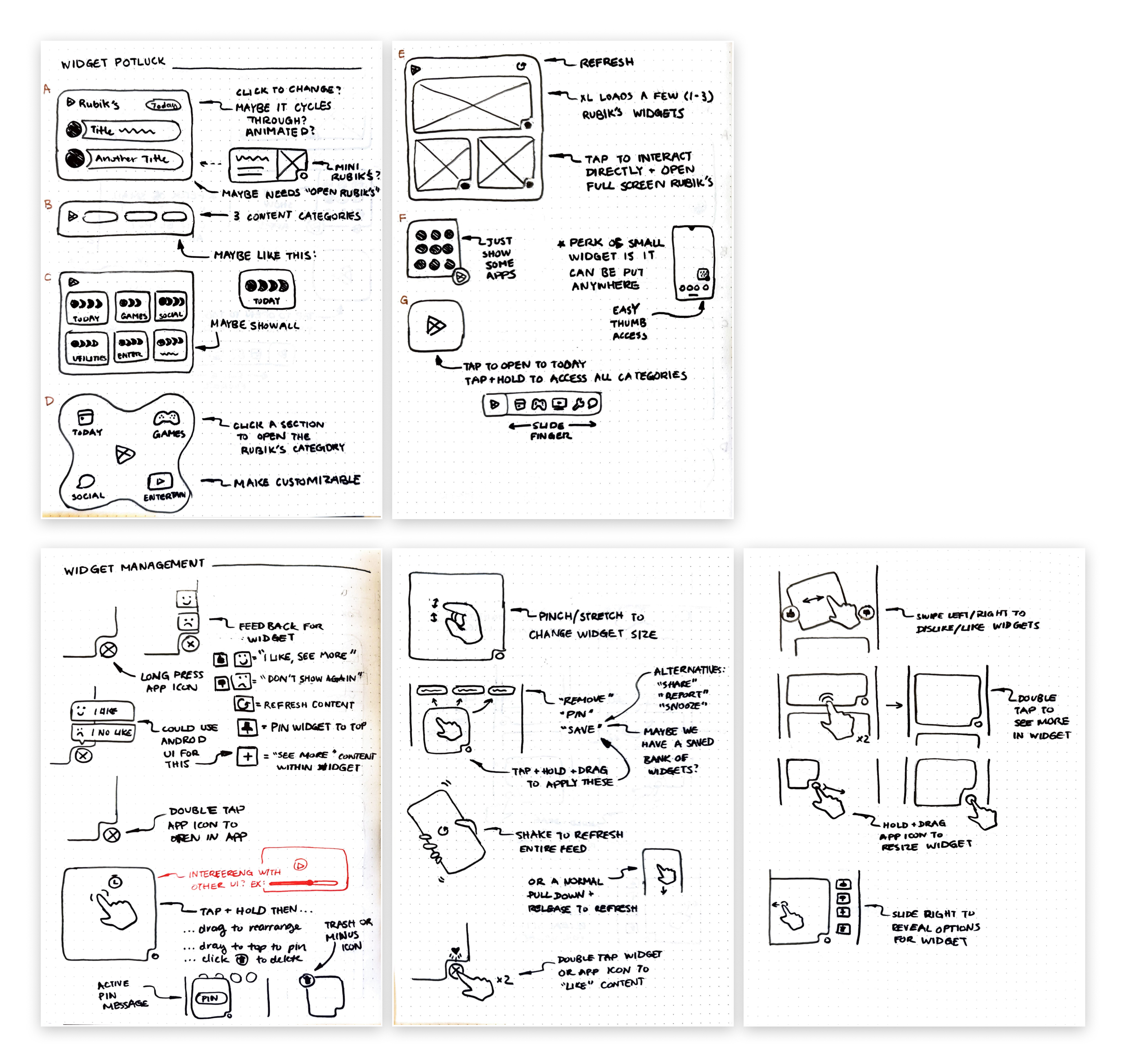
While I was making individual mockups, I started noticing patterns — moments where the same kind of content (e.g., a "continue shopping" or "track status" prompt) appeared across very different apps and arguably should follow a shared visual or interaction pattern for user familiarity.
Knowing that intuitive UX patterns would be important for the widget system, I proposed system access and management designs. I shared these with the team in my final presentation along with my exported mocks, framing them as guidelines that could shape how the team thought about cross-app consistency going forward.
This ended up being one of the parts of the project I was most inspired by. It wasn't part of my brief, but it was the part that let me think about the whole system's design strategy. If I had more time, I would have liked to expand upon this system.
Part of the way through the summer, my manager went on leave and her manager, the team's design strategy lead, became my direct manager. This shift gave me more direct exposure to senior-level strategic thinking and changed the kind of feedback I was getting on my work—both guidance on how to improve my design skills and how to connect my work to the bigger team narrative. I feel really fortunate to learn from them both in such a short period of time!
Collections by Google Play launched at I/O 2024. The team was able to get leadership buy-in and continued building on top of the foundation that was set during summer 2022, using home screen real estate to surface content from already-installed apps in a way that respects users' time and trust. Our team’s design strategy lead excitedly messaged me when the news went public, saying it was rare for interns’ projects make it to production, especially for such a new and consumer-facing one like this.
You can read more about the launch in Google's official announcement.

Outside of the Collections work, I spent about 20% of my time on a smaller project: a competitive and comparative analysis for a feature redesign in a more established Google product. I analyzed 10 competing apps and 46 comparable apps and websites, took screenshots and notes on the UI patterns I found interesting, and synthesized everything into a deck with 15 insights and 4 recommendations for how to move forward.
The PM I worked with said the deck would also serve as a reusable resource for future related projects on his team, which felt like a good outcome for a short engagement. I was appreciative that my manager supported me when I asked for an additional opportunity to expand the people and projects I could gain experience from during my summer.
Three big takeaways:
I felt incredibly lucky to learn from so many talented mentors on the Google Play team that summer, and even luckier to be able to point at a launched feature two years later and say "I was part of that."